

Even if such changes cause worried faces on the one hand, Google is basically doing the web user a huge favor with this measure:
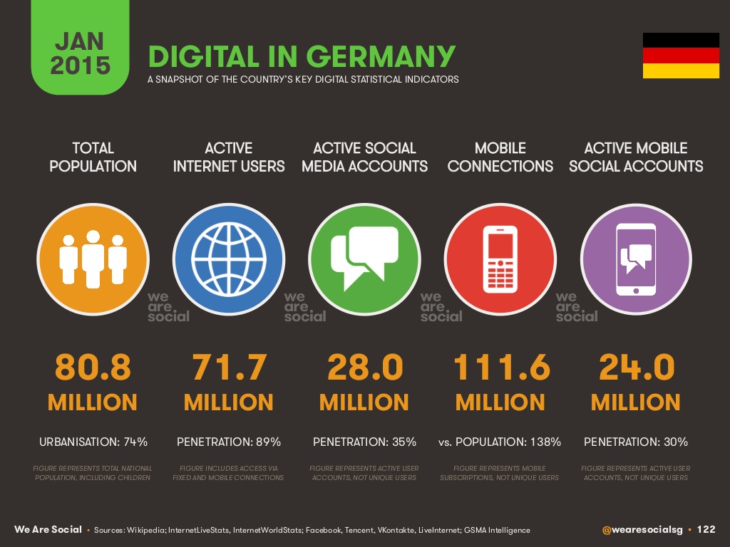
In Germany, 89% of the population actively use the Internet. That is 71.7 million people. Of these, 39.2 million people use the internet via mobile devices. That is 48% of the German population who use the internet on a mobile device every day.
And the trend is rising! According to the latest report: "Digital, Social and Mobile in 2015 report" by the organization "We are Social", web traffic from mobile users has increased by 39% since January 2014, with a third of all websites worldwide being displayed on mobile devices.
Google announced in Maythat in 10 countries, including the U.S., Japan and Germany, more searches were made on smartphones than on desktop PCs.
If these figures are not convincing enough for you, you should simply ask yourself how you use the Internet nowadays and how often you actually use your smartphone or tablet instead of switching on your PC when you want to do some quick online research.
If you already own a website with "Responsive Design", you must be aware of the obvious advantages not have to be convinced first.
Small businesses that do not have a mobile-optimized website or even a website at all are basically invisible to the majority of Internet users, and therefore to potential customers, when it comes to finding their products and services via mobile devices - this is especially true for local businesses.
The good news is that it has never been easier to put a mobile-optimized website online or to transform an existing website into a mobile-friendly site.
On behalf of the IT Consulting Hüppmeier I reprogrammed the existing website of an osteopathic naturopathic practice in Münster into a site optimized for mobile devices. One of Ms. Hüppmeier's main concerns was that the effort involved in adapting the code might be far too expensive and that it would therefore be more worthwhile to have a completely new website programmed.
After examining the website in question, I submitted a corresponding offer. In the end, the time and money involved was many times less than it would have been for a complete reprogramming.
You can view the mobile-optimized result, which only required a single daily rate, here: http://www.osteopathie-am-kiepenkerl.de
It is best to access the link with a tablet or smartphone to try out the mobile view. If you access the link using a desktop computer or laptop, you can also see and test the mobile view: simply narrow your browser window so that the window width looks like an iPad or smartphone.
You can test the above-linked site for mobile views particularly easily if you use an online tool such as Screenfly from Quirktools or responsive-design-test.de use.
If you are also interested in such a dynamic adaptation of your existing website, I look forward to receiving your email!
0 Comments