Inwardly, I shake myself every time I am asked this question. But I remain patient and explain why the size of the logo on a website should be reduced to a minimum and why an oversized logo can even be annoying or out of place.
Today I would also like to explain this rather interesting topic to you.
If the logo were bigger...
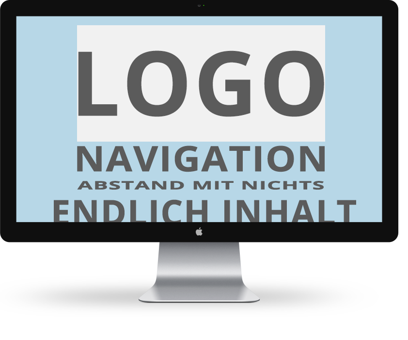
The following graphics clearly show where the "problem" actually lies.

Somehow overloaded... 
No more insight... 
Space wasted on a website...
What's so bad about making the logo bigger?
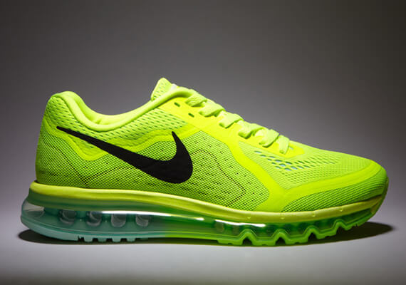
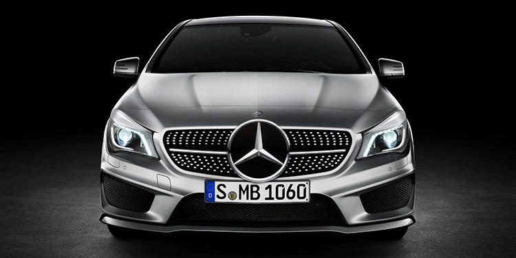
In the picture examples above, I have already somewhat exaggerated the problem. But you can see what it's all about, can't you? Basically, there's nothing wrong with opting for a giant logo. There are various examples where prominent logos look very good:

but on the web? Hmm...
Why you don't need to make your logo bigger
Please don't get me wrong: of course I appreciate and need your opinions and ideas regarding your web design wishes! Nevertheless, you should bear the following points in mind:
- Your site visitors are not blind - For this reason alone, your logo should not be given an oversized section on what is actually very valuable, limited screen space. And this is just to indicate which page you are on. Take a closer look at the logo layout on the websites of the brands mentioned above: Mercedes Benz, Ray Ban, Nike. Compared to the navigation and the product presentation, the logo display is absolutely secondary.
- Your logo has no real benefit for the visitor. - The limited space on the homepage is far too valuable to waste it on something so useless for the visitor. You want to keep the visitor from "clicking away" and "googling on"!
- Your website is not about YOU - This is difficult for many companies to swallow at first. Your website is not made for you, but for your customers and potential new customers. Creating a consistent look and feel is good and should be encouraged wherever possible. But to achieve consistency, it is not necessary to overwhelm your site visitors/prospects/customers/new customers with your logo.
- A giant logo can push other more important page elements out of the precious field of vision - Wouldn't you prefer to take advantage of the brief moment of 100% attention of your site visitor and draw their attention to your chic products and services?
- Large logos can disrupt your website - This is basically a kind of summary of all the points mentioned so far:
Large logos distract from the added value and benefits of your website. Unless you want to sell the logo instead of your products.
Learn to understand what the actual purpose of a website is: Information provision, customer service, product presentation, etc.
I hope I was able to give you an understanding of the advantages and productively sensible reasons for a less prominent logo on your website. Let me know what you think about this topic.
Best regards
Saskia Lund


0 Comments